
Notice
Recent Posts
Recent Comments
Link
| 일 | 월 | 화 | 수 | 목 | 금 | 토 |
|---|---|---|---|---|---|---|
| 1 | 2 | 3 | 4 | 5 | 6 | 7 |
| 8 | 9 | 10 | 11 | 12 | 13 | 14 |
| 15 | 16 | 17 | 18 | 19 | 20 | 21 |
| 22 | 23 | 24 | 25 | 26 | 27 | 28 |
| 29 | 30 |
Tags
- 단방향
- css
- nomadcoder
- 트랜잭션
- React
- JS
- 노마드코더
- 장고
- 매핑
- 일대다
- frontend
- html
- 장고독학
- python
- 영속성 컨텍스트
- TODO
- Django
- JPA
- ORM
- AWS
- SBERT
- clonecoding
- java
- 프론트엔드
- 바닐라js
- 플러시
- javascript
- web
- 다대다
- 다대일
Archives
- Today
- Total
꿈꾸는 새벽하늘
[생활코딩-WEB2] CSS (2) 본문
1. 그리드
(1) <div> 와 <span>
	<div id="grid">
            <div>TITLE</div>
            <div>ARTICLE</div>
        </div>
<span id="grid">
<span>TITLE</span>
<span>ARTICLE</span>
</span>
- <div>
- 아무 의미 없는 디자인 목적의 태그
- block level element
- 자동 줄바꿈 O
- <span>
- 아무 의미 없는 디자인 목적의 태그
- inline level element
- 자동 줄바꿈 X
(2) grid-template-columns
        <style>
            #grid {
                border: 5px solid palevioletred;
                display: grid;
                grid-template-columns: 2fr 1fr;
            }
            div {
                border: 5px solid pink;
            }
        </style>
- grid-template-columns: 150px 1fr;
- 첫 번째 태그는 150px로 지정, 두 번째 태그는 남은 공간 사용
- grid-template-columns: 1fr 1fr;
- 화면을 1:1로 나누어서 사용
- grid-template-columns: 2fr 1fr;
- 화면을 2:1로 나누어서 사용
2. 그리드 적용
<!DOCTYPE html>
<html>
<head>
<title>Notice - My Web</title>
<style>
body {
margin: 0;
}
a {
color: black;
text-decoration: none;
}
h1 {
font-size: 45px;
text-align: center;
border-bottom: 1px solid gray;
margin: 0;
padding: 20px;
}
ol {
border-right: 1px solid gray;
width: 100px;
margin: 0;
padding: 20px;
}
#grid {
display: grid;
grid-template-columns: 150px 1fr;
}
#grid ol {
padding-left: 35px;
padding-top: 25px;
}
#grid #notice {
padding-left: 25px;
}
</style>
</head>
<body>
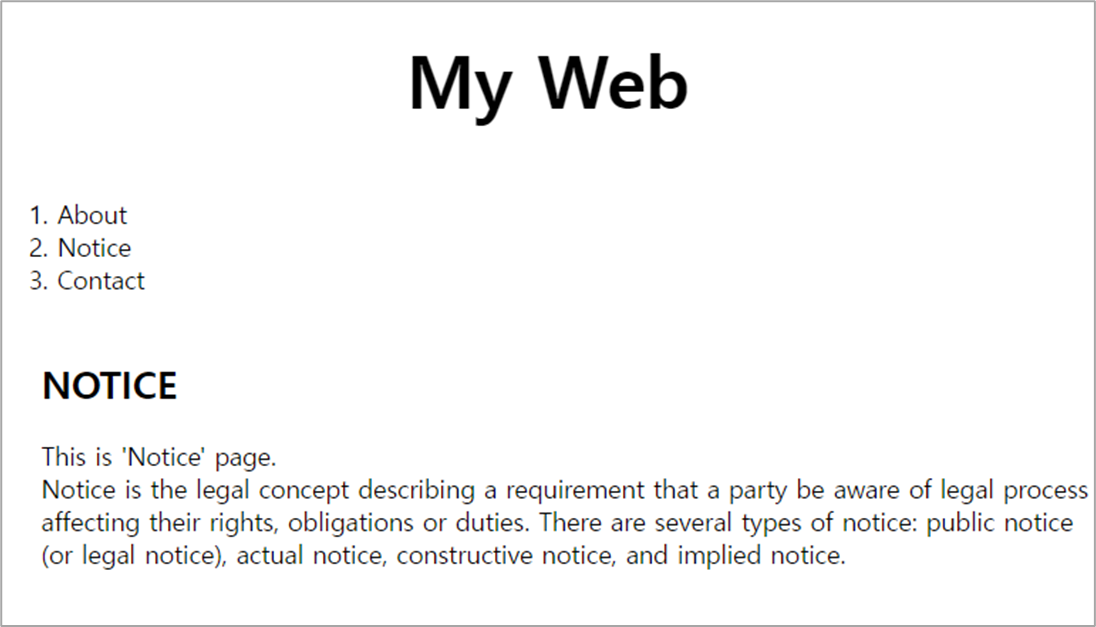
<h1><a href="myweb.html">My Web</a></h1>
<div id="grid">
<ol>
<li><a href="about.html">About</a></li>
<li><a href="Notice.html">Notice</a></li>
<li><a href="contact.html">Contact</a></li>
</ol>
<div id="notice">
<h2>NOTICE</h2>
<p>
This is 'Notice' page.<br>
Notice is the legal concept describing a requirement that a party be aware of legal process affecting their rights, obligations or duties. There are several types of notice: public notice (or legal notice), actual notice, constructive notice, and implied notice.
</p>
</div>
</div>
</body>
</html>
3. 미디어 쿼리 (Media Query)
- 반응형 웹 (Responsive Web), 반응형 디자인 (Responsive Design) : 화면의 크기에 따라서 웹페이지의 각 요소들이 반응하여 최적화된 모양으로 바뀌게 하는 것
- CSS에서는 미디어 쿼리를 통해 반응형 웹을 구현할 수 있다.
	    @media(min-width: 800px) {
                div {
                    display: none;
                }
            }
=> 화면 크기가 800px보다 커지면 <div> 태그에 해당하는 것이 화면에서 보이지 않게 된다.
	    @media(max-width: 800px) {
                div {
                    display: none;
                }
            }
=> 화면 크기가 800px보다 작아지면 <div> 태그에 해당하는 것이 화면에서 보이지 않게 된다.
4. 미디어 쿼리 적용
<!DOCTYPE html>
<html>
    <head>
        <title>Notice - My Web</title>
        <style>
            body {
                margin: 0;
            }
            a {
                color: black;
                text-decoration: none;
            }
            h1 {
                font-size: 45px;
                text-align: center;
                border-bottom: 1px solid gray;
                margin: 0;
                padding: 20px;
            }
            ol {
                border-right: 1px solid gray;
                width: 100px;
                margin: 0;
                padding: 20px;
            }
            #grid {
                display: grid;
                grid-template-columns: 150px 1fr;
            }
            #grid ol {
                padding-left: 35px;
                padding-top: 25px;
            }
            #grid #notice {
                padding-left: 25px;
            }
            @media(max-width: 800px) {
                #grid {
                    display: block;
                }
                ol {
                border-right: none;
                }
                h1 {
                border-bottom: none;
                }
            }
        </style>
    </head>
    <body>
        <h1><a href="myweb.html">My Web</a></h1>
        <div id="grid">
            <ol>
                <li><a href="about.html">About</a></li>
                <li><a href="Notice.html">Notice</a></li>
                <li><a href="contact.html">Contact</a></li>
            </ol>
            <div id="notice">
                <h2>NOTICE</h2>
                <p>
                    This is 'Notice' page.<br>
                    Notice is the legal concept describing a requirement that a party be aware of legal process affecting their rights, obligations or duties. There are several types of notice: public notice (or legal notice), actual notice, constructive notice, and implied notice.
                </p>
            </div>
        </div>
    </body>
</html>

5. CSS 코드의 재사용
1단계 : style.css 파일을 만들어서 <style> 태그 안의 코드를 복사한다.
2단계 : html 코드에서 <style> 태그를 삭제하고 아래의 <link> 태그를 <head> 태그 안에 작성한다.
<link rel="stylesheet" href="style.css">'💻 Programming' 카테고리의 다른 글
| [노마드코더] JavaScript (2) (0) | 2022.06.23 |
|---|---|
| [노마드코더] JavaScript (1) (0) | 2022.06.23 |
| [생활코딩-WEB2] CSS (1) (0) | 2022.05.04 |
| [생활코딩-WEB1] HTML (2) (0) | 2022.04.07 |
| [생활코딩-WEB1] HTML (1) (0) | 2022.03.31 |
'💻 Programming' Related Articles
more
